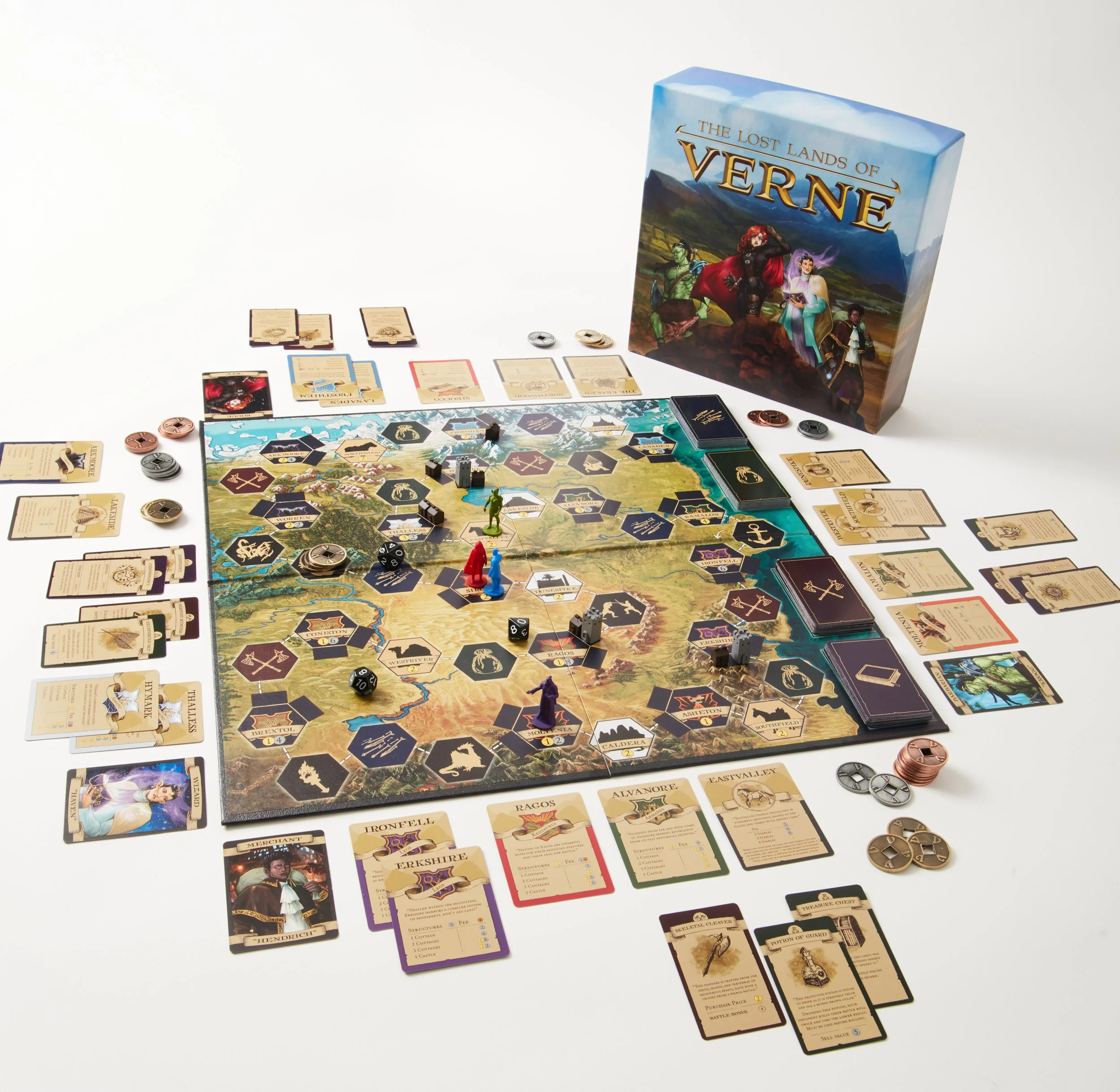
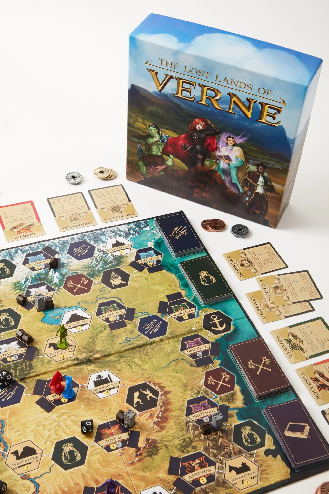
I was contracted by Verne Adventures LLC. to create branding materials as well as upgraded game assets for the their tabletop roleplaying game The Lost Lands of Verne. I took on a variety of projects as the sole team designer, including logo design, illustration, printed material production, motion graphics, and front-end web design.
The Ask
Inspiration and Core Aesthetics
The Lost Lands of Verne holds Dungeons & Dragons in it’s core. Based on the founder’s long-running DnD campaign, Verne strives for a fully immersive, interactive adventure full of imaginitive exploration and high stakes.
When designing visuals for Verne, there were key points to keep in mind:
A medieval fantasy setting.
Appealing characters.
The importance of dynamic gameplay.
The option to customize the ruleset per game.
Overhaul and Marketing
Verne was in it’s initial founders release. The team planned to release a second edition following community and expert feedback, of which would need an almost complete visual overhaul. Progress points in the design process would be used for social media marketing, and so would need to be structured in an organized matter.
Visual Components
Verne’s palette encompassed the dirt and grit of exploring a new land. Browns and yellows took the lead on aesthetics, but the team strove for more energy and incorporating a clean, easy to parse look that still captured the essence of an old-timey battlefront.
Important elements:
Parchment backing
Inked lettering
Detailed but uncluttered illustrations
Untarnished metals
Easily recognizable icons
Expanding to New Mediums
All new assets would need to be usable for future projects in both digital and print. Verne Adventures had both short and long term goals for the future of their game, including expansions and interactive digital media. Creating videos to teach game mechanics to new players was on the list of content planned to promote the new edition.
Online Presence
Verne’s original website was built on Squarespace as a basic introduction to the game itself, showcasing a few photos and an outgoing link to purchase the game on a third party website. The team wanted to redo the website to explain more of the game components, add team and community updates, and a way to purchase the game without leaving website itself. This would likely require integration with Shopify.
A large part of Verne is its focus on dynamic gameplay. I wanted to make use of this idea in the website to the best of my ability.
Because this was an immediate need, we chose to use the already standing user journey as a base to improve upon. After researching competitors like The One Ring and City of Mist, I sketched concepts for a new, dynamic website layout.


Wireframes
Because Verne originally did not have enough full sized, unique artwork to immediately capture a viewers attention, we decided the hero image would instead be a full screen video eyecatch. The motion would provide the dynamicism needed to engage the audience. In the future, when Verne collected a number of character artwork and icons, we would switch to a more in depth display of the characters and story, including transitions and animations.
The first draft of the wireframes can be seen below. There is a greater focus on images rather than text in an effort to entice the viewer to purchase the game, without having new custom content.
Version 2 was reworked to showcase more of the player base interaction, and how active the community around the product is. Changes (highlighted in red) included adding a testimonial carousel, news/blog post feature, and easy access to gameplay information such as included materials. Image carousels would be added to each news post to keep event photos organized without needing a separate page only for image galleries.
Mockups
Slight changes were made during the mockup stage such as reducing scroll space to implement transitions and encourage users to click on buttons to move to new areas of the website. The newsletter subscription was changed to a pop-up on the home page— immediately putting it in the users view and dimming the rest of the page for focus.
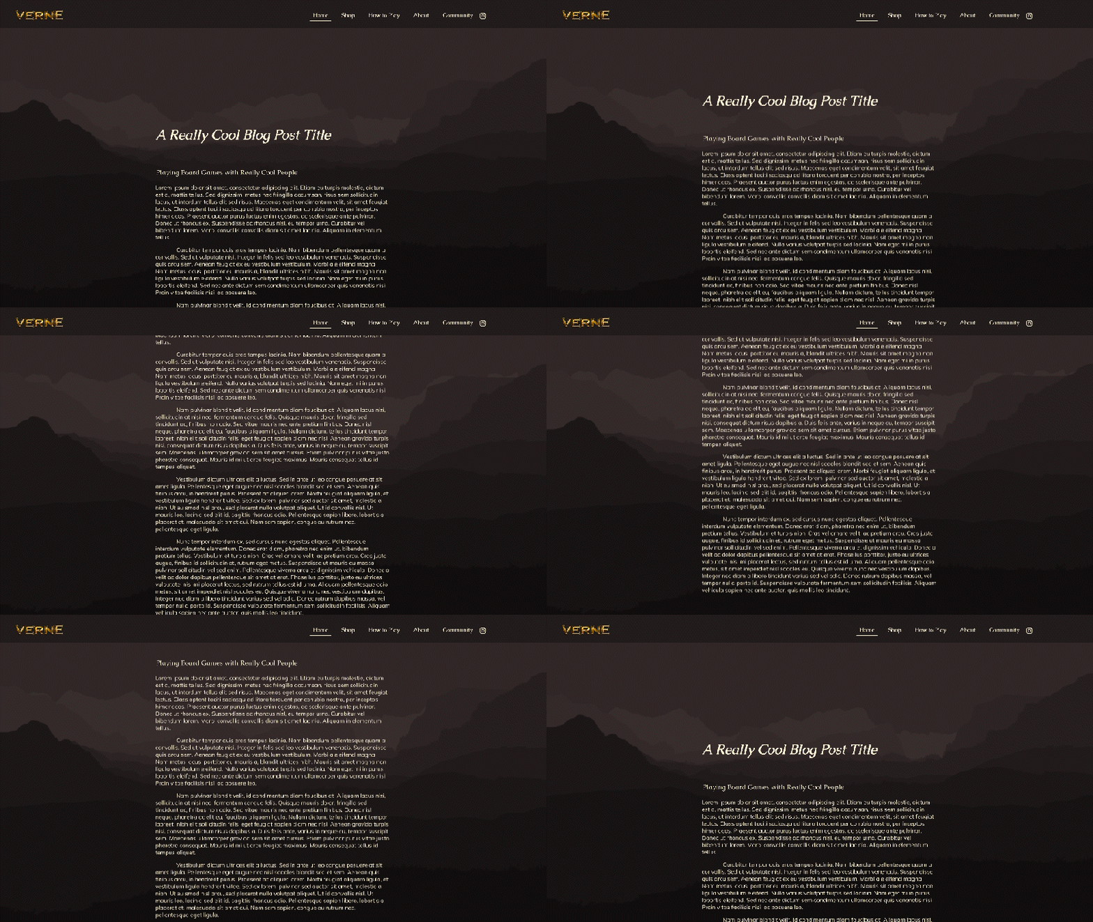
Example of parallax background animation with scroll.
In another effort to integrate visual dynamisicm, I decided to make the background graphic of the website a parallax image that would animate as a user scrolls down the page. I used the original landscape artwork of Verne, seperating layers of the landscape into their own silohuettes.
*Parallax does not work natively in Figma and will not animate in the prototype.
Challenges
Redesigning the website was an immediate need for Verne. I felt as though I could have made better aesthetic decisions with more time as I was not fully satisfied with the use of the color palette or imagery. There was also the lack of visual assets available to me, with little room to ask for new renders or photographs. Ideally, I wanted to have floating imagery of game components and character artwork working alongside the parallax background.
A core component of tabletop roleplaying games is an immersive character experience. People are automatically drawn to the faces of characters and will want to learn more about them. Unfortunately, the complete lack of character artwork kept the website design from reaching its full potentional as a lively, dynamic experience.
Welcoming New Players
My next task on the Verne team was to create an animated ‘How to Play’ video, similar to those of other popular games like Catan. This would be an introductory video to the game, helping new players learn basic rules to Verne.
My role included storyboarding, illustrating assets, and animating the entire video. After receiving the script, I set about creating a simple, easy to follow storyboard.
Animatic/Draft
All assets were created in Adobe Illustrator and imported to AfterEffects to be animated. I created a short draft with basic animations to better inform the team of the script timing. Once receiving the voiceover files, I would only need to adjust some keyframe spacing and replace the drafted assets.
The completed gameplay overview video can be viewed on Verne’s YouTube channel. The final product required some use of 3D for the dice animations.
Identity Renewal
My next task was to create a logo for Verne Adventures itself, as the company did not have their own branding. I wanted to incorporate the aesthetics of a roleplaying adventure game and keep the design close to that of their flagship product.
Key points included:
Utilizing sans-serif fonts for an olden, medieval look.
Incorporating a simple, relevant symbol.
A design that could be read with only one color/as a silhouette, for use across a variety of products.
I offered a variety of typefaces to the team, complimented by symbols usually seen in the tabletop roleplaying game community: swords, dice, and dragons. Because the main visual of Verne was its landscape, I offered a version with mountains as the symbol, but this did not lend itself to the ‘medieval adventure’ theme so much as hiking in the wilds. After presenting these to the team, I created other iterations based on their feedback.
Illustration Overhaul
Next on the list was the monumental undertaking of redesigning almost all game assets, from cards to board tiles to character artwork on the game box. We wanted to create designs that were clean and easily readable, and could also be utilized as templates for any new content that was being added with the upcoming game edition. There were some aspects I did want to keep, though; I liked the use of parchment as a background, and visual indicators of each coin type.
Reworking the Cards
Verne’s card assets were divided into the following categories:
Scroll cards, which designated locations/property.
Items cards
Equipment cards
Spells cards
Encounter cards
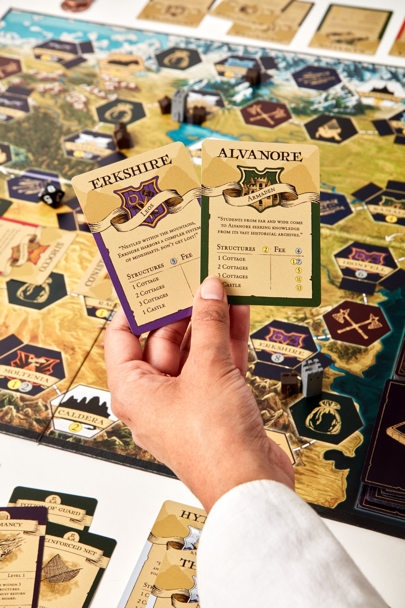
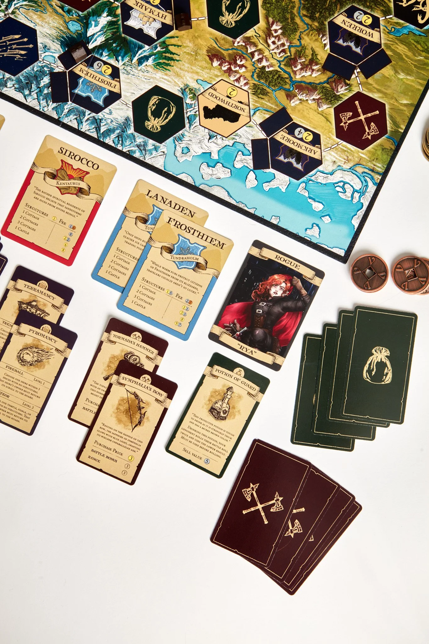
Because Verne held a focus on trade and commerce, I wanted each card to look like a hand-penned ledger, or a kind of certificate of ownership. I chose inky, gritty fonts and brushes that would make each design seem uniquely drawn, even though they were created as templates. I also stuck with simple lines and shapes with solid colors for readability, not only for the card designs, but also for the reworked location crests that would be displayed on all Scroll cards. With the Scroll crests, I also had to ensure the designs would display well when partially covered by a title.
I also offered horizontal versions of the items, equipment, spell, and encounter cards as the originals were oriented horizontally.
Designs for Scroll cards
Scroll variations (Stables, Temples)
Other scrolls (Character card, Boss card)
Designs for other cards in both vertical and horizontal orientations (Item card used in example)
Designs for other cards (Item card used in example)
Other card template variations (Equipment, Spell, Encounter)
New Tile Designs
The tiles on the game board were their own template displaying the location crest, name, and cost to own said location. These designs reused assets from the cards.
Redesigned crests — old on the left, new on the right.
Character Illustration and Boxart
Because the boxart was only the landscape key art, the team wanted characters on the box for engagement. I created new illustrations for already established characters. I took to a rendering style reminiscent of realistic fantasy artwork while accenting it with textured lineart to match the new aesthetic of the game assets.
Hendrich / Merchant
Rya / Rouge
Haven / Wizard
Krogg / Barbarian

